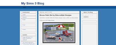
I ran out of time before my mother came back from her vacation so everything wasn't done and I'm trying to finish that all up. Another thing I was sorting out the categories that I hoped would be done weeks ago and lastly, I'm in love with the latest design feature from blogger. I'm probably going to change that in the next week or two. None of these are exactly what I want, but I was just playing and thought I'd show. It's probably going to be a combination of the first three, the third is the closest I could get to the current and the last is just for nothing, I guess.
Anyway, be back later:)


i like the black background
ReplyDeletei like the 3th and the 4th background. but the 2nd is okay and the 1st is uglyyy :D
ReplyDeletemy favourite is the 3th. it looks like summer :DDDDDDDDDD
I like the fourth!
ReplyDeleteThird one looks the best. I like how crisp and smooth it looks
ReplyDeletesecond
ReplyDeleteI like the 4th, the black one, because my eyes are very sensitive. So the dark screen is more relaxing. I also think black looks more professional ;)
ReplyDeleteI think that the fourth layout looks the best. Dark backgrounds look nice, in my opinion.
ReplyDeleteIt's a great new feature, isn't it? Pick whichever one you're most comfortable with - I'll visit regardless of what it looks like. :)
ReplyDeleteAll of them are nice, but I like the third one the best. :)
ReplyDeleteBlack looks best.
ReplyDeleteThe third one minus the huge title. It's fresh, comfortable, summersky and free.
ReplyDeleteI don't like the fourth one at all. Doesn't feel very Sims to me. Black is always the easiest choice and also less stylish.
Fourth or Third are my picks.
ReplyDeletePeople who don't like change WOULD like the third.
This comment has been removed by the author.
ReplyDeleteI like dark/black templates alot, but I do like the third one. :)
ReplyDeleteI would choose the third one, last one is nice but I don't think it's the style for this site at all. Whatever you choose will be ok for us :)
ReplyDeleteFirst and second are the best IMO.
ReplyDeleteI love the first one! it looks smooth and easy to browse around. Pick the 1st one.
ReplyDeleteThe black one looks far more professional!
ReplyDeleteDon't fix what ain't broken! I would keep the colorsheme, the bold black titles for each upload and the black seperationlines
ReplyDeleteThe site with it's qhite background looks more inviting, it fits the sims 3 theme, i found the black background less attractive.
Imo the 2nd one looks quite ok, but overall i don't like any of the new designs, they all feel watered down and too soft and the black one doesn't fit Sims 3 at all.
To give you feedback on this plan of yours, but maybe i'm also only a type of person who doesn't like change. Settle for a design, apply it and sticky a post for some days, how people like it, that's what i would do.
I love the black one.
ReplyDeleteI like the color scheme that you have now. #3 updates it stylishly. It has a nice clean look. Gets rid of choppy boxes and 1pt rule.
ReplyDeleteDesign is so subjective and everyone's sense of aesthetics obviously varies. In my experience you're best to go with what you like and what works for you. Go with your gut feeling - the design you intuitively go back to over and over again. People will get used to it and it's the continuous information that you give us that makes this blog a 'must visit everyday'. Thanks for all your hard work - no matter what layout you choose.
ReplyDeleteI like the style we have now, personally.
ReplyDeleteOhhh, I love the black! :)
ReplyDeleteYeah do what you like, but i won't choose the black one, that change is too radical.
ReplyDeleteTastes vary.. some like fat chicks some like model chicks :)
All are nice!
ReplyDeleteBut I personally liked more the third one, cause it kind of "match" with Sims.
I don't know.. maybe's that's because the white and blue..
I guess. :D
Thanks Joe, for this great blog!
I like the first and second. don't care for the black at all though, it drowns everything out...:/
ReplyDeletethe black one is the best.
ReplyDeleteBLAAAAAACK PLEASE!
ReplyDeleteDont care, as long as you keep updating......when you can of course.
ReplyDeleteBlack background FTW!
ReplyDeleteThe second and third are my favorites.
ReplyDeleteI like the black version.
ReplyDeleteI like second and fourth.
ReplyDeleteI agree with what Caroline said. I'm changing up also!! Very excited! Good luck with your decision and hope everything worked out for your Mom!
ReplyDeleteI like the second and fourth ones.
ReplyDeleteHope you can decide with so many diferent opinions :)
The black one looks great! Just what you need for this mighty blog of yours! ;-)))
ReplyDeletesecond!
ReplyDeleteThe third one. I just love that blue, shining bright :)
ReplyDeleteThe black one sucks so bad i cannot find words for it, doesn't fit a public site where thousands of people visit everyday, it has to stay bright and friendly.
ReplyDelete^ Agree
ReplyDeleteThe sims colors are white and lightblue, soft colors which invite you in, the black one drowns everything and looks like a graveyard :/
Do what YOU prefere, but don't clutter it up, it has to stay friendly and easy to the eye!
ReplyDeleteI like the second third and last. But maybe you the last one would be the best considering black pages take less energy to load on a CRT monitor compared to white pages. Go environment.
ReplyDeleteBlack is beautiful, has it charme, but come on, it has nothing to do with the sims! The Sims is fun, light. So I'd say the second or third. And it's cool to keep a bit of the air of the original blog. In fact I wouldn't change the template. The blog has already many pics, imagine someone that has a very slow connection, to open a heavy page. Please think of those poor souls.
ReplyDeleteThank you for asking our opnion, but don't forget that it is your blog, your work to post, so make your choice thinking more about you :)
I like the third one
ReplyDeleteI like the last two so any of these would be nice
ReplyDeleteBlack and White ones for me, the blue one looks absolute shit and the gradient-background one looks too standard.
ReplyDeletei like the last first and last. they are nice
ReplyDeletepick the dark blue 1st one. it's in between the light blue and the black
ReplyDeleteSECOND ONE! NUMBER 2! SECOND ONE! NUMBER 2! SECOND ONE! NUMBER 2! SECOND ONE! NUMBER 2! SECOND ONE! NUMBER 2! SECOND ONE! NUMBER 2! SECOND ONE! NUMBER 2! SECOND ONE! NUMBER 2! SECOND ONE! NUMBER 2! SECOND ONE! NUMBER 2! SECOND ONE! NUMBER 2! <333
ReplyDeleteSecond! Looks easy to browse around :3... I liked the 3rd one at first but I would've gotten tired of it in a while
ReplyDeleteJoe, did you get my email?
ReplyDeleteI sent one yesterday.
I know you're really busy right now but please read it and let me know what you think.
Oh and I love the black design. Sims 3 Updates and Free Sims Finds have black bacground color for their sites. They look really good.
But this is your blog so you can pick whatever color you like. :)
Definitely #3. Just without that humongous title.
ReplyDeletei like the first or the fourth
ReplyDeletefourth
ReplyDelete1st or 2nd
ReplyDeleteFIRST ONE!
ReplyDeleteBlack.
ReplyDelete